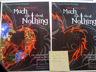
I was told to create a Shakespeare poster of any play of my choice, this poster would be designed for the Garrick Theater in Litchfiled. My chosen play was Much Ado About Nothing as it was the play I have more knowledge of to help me with ideas and designs.

Again I research into typefaces to find which is the most fitting for my project here I tried to find fonts that looked romantic or fitting for a comedy to fit the play that I had chosen. In the end I chose a font that was called 'Fatal Romance' which as you will be able to tell from my finished design in my portfolio that It fitted well with the design and suited well with the Shakespeare play.

After researching into images, the play anything to inspire myself I then start to sketch my ideas down or anything that will help me come up with my final design I looked at a lot of border designs and hearts to show the love in the play. Landscape and portrait.
After my sketches I always take 2 forward to add more detail too and after that I will take one further add a lot of detail and try to draw it actual size to give me an idea of spacing and what size of type I should use within my design.
At the end of the projects their is always a lot of tweaking and different attempts that go on to try and make sure the design is the best that it could be, here i tried to include collage, make different patches of material patched together to show people falling out but finding a way to work things out, patch their relationships together. However I found that my design looked more professional and traditional without lots of colour and a more simple design.


No comments:
Post a Comment