
University Challenge
Folder work: Mind
A smile in the Mind is the brief I am currently working on, I took photos of my folder work to show how I work out my ideas through research, sketches and ideas to create my final piece.
In this project I will be creating a leaflet and a business card for a company called 'Mind' this company wants leaflets and cards to be given out to people who are in need of help or know someone with mental health issues such as depression and self harm.

This is part of my design pattern where I use websites like 'dafont.com' to research into fitting typefaces with my projects for example for this project I was looking for type that looks hand written like self harm would be or someone writing for help about their mental health issues. I also looked into hard to read type as people suffering with mental health issues might find it hard to feel their emotions feel numb so its hard to see themselves being happy at the end of it all.

After all the research, gathering information and inspiring images I then sketch any of my ideas on layout paper in rough before taking 2 of my favorite ideas further adding more detail and colour. Here I drew a little black rain cloud raining on 'A Smile in the Mind' symbolizing always having bad days and having their parade rained on. I have also drew faces with blocked out faces or mouths, people may not be themselves when dealing with mental health or might not feel they can speak up about their mental health issues scared of how people would judge, they just want to hide themselves. The funny squiggles on one of my designs should actually be type, a lot of emotions and feelings covering the page with typography with them fading away as they head towards 'A Smile in the Mind' saying that the feelings would fade away with the the company.

Here are just some of the back of the leaflet ideas where information from the brief needs to be fitted in in a way that would look interesting. I have included thought bubbles, squiggles representing peoples minds feeling all over the place and unable to cope and just a simple neat option of blocks in set rows.
So far in this project I have decided to take the black raincloud idea and is making a start to designing the front of the leaflet.
Folder Work: Illustration
This folder shows you how I work through my illustration briefs, unfortunately this isn't the folder that matches the work that I show you in my portfolio as my tutor still has hold of it. This brief was for a piece of work that showed editorial illustrations we were given a choice of magazine clippings and we had to create editorial images to fit their stories using influences from artists we researched.

After research on editorial illustration I then work on on experimental work for chosen artists I have liked the look of whilst researching for the brief. I'm not a strong drawer I prefer to do a lot of my work on the macs digitally. Here i sketched out drawings in the style of chosen artists and attempted to water colour them to get me started on ideas for my final piece.


Here is where i sketch out ideas for where places fit well where images could compliment the body copy and helps give me an idea designing images and the shapes of the images to fit in well to bring it all together.
Folder Work: Much Ado
I was told to create a Shakespeare poster of any play of my choice, this poster would be designed for the Garrick Theater in Litchfiled. My chosen play was Much Ado About Nothing as it was the play I have more knowledge of to help me with ideas and designs.

Again I research into typefaces to find which is the most fitting for my project here I tried to find fonts that looked romantic or fitting for a comedy to fit the play that I had chosen. In the end I chose a font that was called 'Fatal Romance' which as you will be able to tell from my finished design in my portfolio that It fitted well with the design and suited well with the Shakespeare play.

After researching into images, the play anything to inspire myself I then start to sketch my ideas down or anything that will help me come up with my final design I looked at a lot of border designs and hearts to show the love in the play. Landscape and portrait.

After my sketches I always take 2 forward to add more detail too and after that I will take one further add a lot of detail and try to draw it actual size to give me an idea of spacing and what size of type I should use within my design.

At the end of the projects their is always a lot of tweaking and different attempts that go on to try and make sure the design is the best that it could be, here i tried to include collage, make different patches of material patched together to show people falling out but finding a way to work things out, patch their relationships together. However I found that my design looked more professional and traditional without lots of colour and a more simple design.
Folder Work: Moulin Rouge
My film brief insisted on me choosing a classical theme of my choice and to create a poster that would be advertising it to be coming out in cinema or DVD soon, I had to try and create the poster without using any existing imagery to create something from nothing. I also had to create a DVD front cover design to match the poster that I will create in this project. I chose to create a poster on the well known movie 'Moulin Rouge' as I have a passion for performing arts as well as design, I thought this would bring more fun and interest into my design.

When choosing the type I looked for any type that looked like it would be used on Broadway or any type that would be found in a circus as the Moulin Rouge had the big dome with a lot of circus themed dancing, costumes and props.

Initial sketch ideas sketched onto layout paper, a lot of diamonds, circles for spot light feel, capital letters to show how big the Moulin Rouge is and fine details are all included in my ideas as to me that sums up the Moulin Rouge's atmosphere and quirkiness through design.


For the poster design I had to think about if I wanted it to be landscape or portrait and where information and symbols would also be included in the design without it ruining the design or making the type and symbols been forgotten, both had to be equal as long as the Title of the movie stud out above the rest to get more of the readers attention.

Again a lot of tweaks are made at the end of projects however I think this project gave me the most as there is a lot of colours I could choose from, a lot of shapes sizes and typefaces to help give justice to this movie. Fabric was also given a lot of thought in this brief in the end I found some silk and photographed it and turned it into a rich red colour to show the the Indian look that the movie had going on with their clothes styles.
Free Design: Music

This piece is one of my favourite and latest pieces, I started it out my hand drawing the shapes you can see in the background originally wanting to paint it multicoloured the bigger the image spreads out, however I decided It worked really well in black and thought it would be a good way to show my love for British music and the punk rock fashion that was around in the 1970s so adding the Union Jack would be a good way to show my appreciation to both, I also decided to add the Photoshop paint brushes to show rebellion through punk rock.
Vintage Clothing Stationary: Rellik

With Compliments Slip

Business Card

Invoice

Here is a stationary set which I very recently designed, this was for a vintage clothing company called 'Rellik' my brief told me to create a letterhead, with compliments slip, business card and an invoice for this company. I was given the eras 1950's to the 1990's to choose a style of fashion and art work to work with for this project. I decided to work with the 1960's after I was looking at the styles of grease the movie, I looked into the styles of hair which made me think of the famous beehive look for the 60's I got to work with the idea straight away. I really liked how my logo design came out, it doesn't look serious and it had a quirky side to it.
Illustration: Children's Book Cinderella
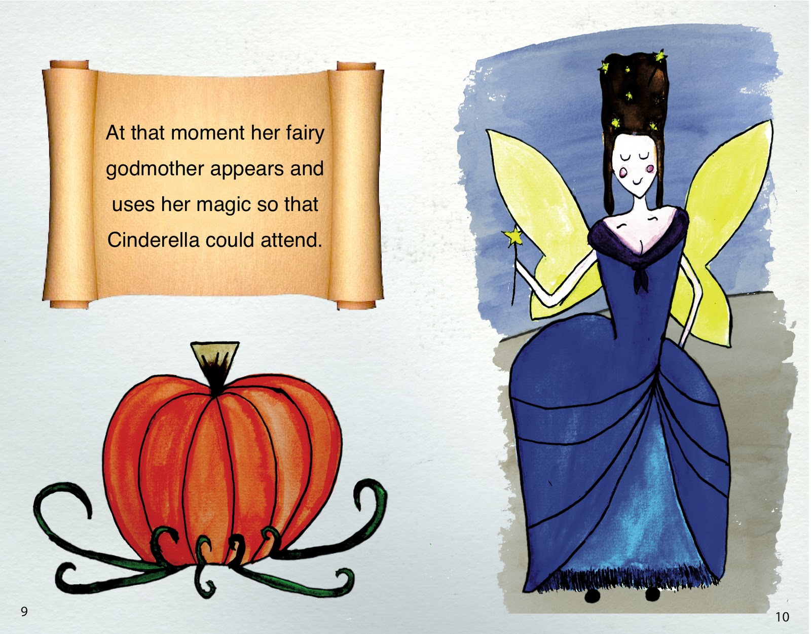
I was given an opportunity to create a double page spread for a children book and I was able to choose a story of my choice as long as I researched into the classic story and illustrations of the story. I had to create a 32 page story board in rough and then again as a neat version before choosing a page to take forward to create. I sketched out my design then adding watercolour to it to put into the computer to then take it further digitally to create a more cartoon affect and to add text. I was pleased with the outcome for this design as I am not a strong drawer and I think that I was able to complete this brief to a high standard.
Movie Poster & DVD: Moulin Rouge


Creating a poster and DVD cover was a fun brief, I chose the film Moulin Rouge to create from scratch and try to show the movie through my design. I used silk for the background, circus feel with the striped top of the tent, a circle of spot light to go around the title and sequins to show the amount of gems and Indian fashion used within the film. I wasn't overly pleased on the outcome for this design as I think that it suits the Rocky Horror Picture Show than the Moulin Rouge however I my tutor loved the design so I thought it would be suitable to include in my portfolio.
Cook Book Pages

I created a double page spread for a cooking book which we created as a class as a whole. The recipe could have been for anything we wanted, as I adore cupcakes I made a vanilla cupcake and made my own coconut truffles to include on top and called it snowflake kisses. On this piece I included the ingredients and the method of the recipe. I also included a top tip to make my design seem personal and useful for the viewers, The title on the right hand side of the page is my own type which I drew out myself to include onto my design. My design was a winter blue colour with snowflakes placed around the text to match the title that I had named my recipe and I thought it all came out professional. I took an depth of field photo of my cupcake so that the viewers would know what it was they were making however i digitally erased the background and added winter trees to the background and added an affect on them to create a blizzard look. I created a dome around the cupcake to make it look like a snow globe and made the colours inside the globe look more vivid to help make it stand out.
Magazine: Gaming


I created a magazine influenced by magazine I liked the graphics of. I chose Front magazine which uses a lot of illustrations and vivid blocked colours in their work and I based it off a gaming magazine as it's a hobby of mine and I spend a lot of time playing games so I thought it would add more interest to the project. I looked forward to this project as I would like to be an art editor. Everything was put together digitally on Photoshop and all the body copy was added on in Indesign to make sure everything was level and in the right columns and were level with any images surrounding the text. The majority of the designs were made from game renders so it saved me time on deleting backgrounds away from figures for me to use in my design. I used a couple of illustrations in my work to show the influences from the Front magazine along with using vivid bold colours. I tried to include different fun ways to include typography in titles and including text in shapes. I wanted to include an advertisement page where I took an image and included a lot of Photoshop brushes to make it look like a piece of art, I took the inspiration from photography I see with models with vectors spinning around them.
Postcards: Animal Abuse


One of the first briefs I was given was to create 5 postcards on any subject, I feel strongly for animal cruelty and I wanted to create postcards with quick shocking information on them to make people re think before they buy just any cosmetics or eat another piece of meat. So with the little Photoshop skills I had at the time I managed to create 5 postcards all looking at different types of animal cruelty. I went to farms and used my dog for photos to include in these postcards, I tried to make them as much of my own as possible. I wanted to use shocking images however I thought that would push people away from picking them up so instead I used shocking information. I included facts, the RSPCA logo and a bloody hand print in the corners of the postcards and I tried to use at least one word of the fact in the colour red to symbolize blood and death. At the time I was really pleased with the outcome on these postcards but with more knowledge of Photoshop and other mac programmes I could get them to a more professional standard.
Shakespeare Theatre Poster: Much Ado About Nothing

This was the last piece I created in my first year however will always be my favorite, I created this piece for a poster in the Garrick Theater in Litchfield for a Shakespeare play of my choice and I chose Much Ado About Nothing as I know the play well which would help me with ideas and designing my final piece. I used and changed a Photoshop brush to create the heart, I had to make it into a shape and distort it as my own to make the piece work. I managed to create an original looking piece with using limited colours and old styled type for the small print. The title I found on 'dafont.com' it was called 'Fatal Romance' which I thought suited well with the image and the romantic and comedy feel to the play. I added to the type to create the typographic affect of the words colliding into each other however now looking back to it I could have done this without creating letters bigger and obvious.
Subscribe to:
Comments (Atom)